As a small business in a creative sector, I’m keenly aware that a refresh within the marketing of a business can be a good idea.
As it’s been 23 years since I started my small business, I thought it was about time to create something new.
Building a brand that flows
For me, my new logo had to have a familiarity to the exisiting logo but still have new elements.
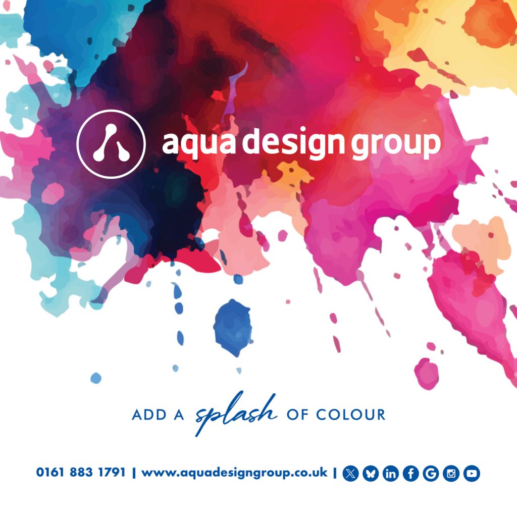
For the new logo, I wanted to create the letter ‘A’ using water drop elements and enclose it in a circle. This will then create a design element that can be used on workwear, stationery and on social media as an avatar.
What’s the font?
I wanted to have a sense of continuity and the best way of doing this was to maintain the main style of font for all the marketing material.
But I also wanted to use new fonts within the marketing and within the new branding.
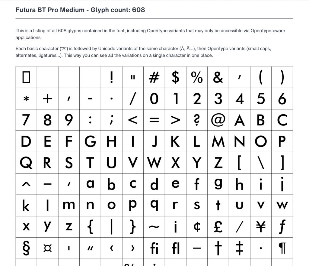
All Genders is a sans serif style font, it’s s family of three fonts Light, Medium and Bold. I chose the Bold as would be easily seen regardless of the size of the logo.
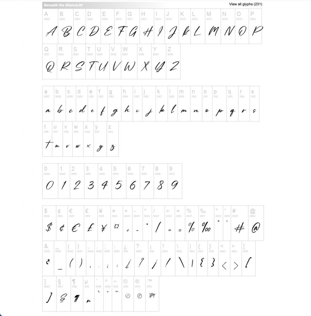
Beneath the Silence font is a script font. I’ve always liked using handwritten and script fonts, but wanted something different to use as part of the new stationery design.
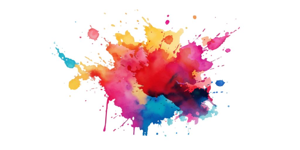
Adding a splash of colour
My previous marketing could be described by some as plain, but I did like the solid Blue used on my brochure design.
As part of the rebranding I wanted incorporate new image elements. So I thought what better than a splash of paint.
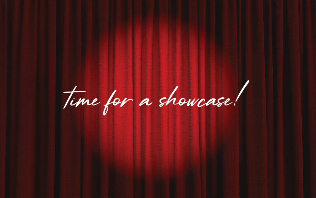
Combining the elements
All the elements of the new branding brought together for a social media poster advertising my small business.
Rewarding results
As part of the rebrand, elements of my exisiting marketing will be updated. So logo incorporated into such things as my Theo Paphitis #SBS Winners Badge.
Recent Comments